Best Interior Paint Colors to Transform Every Room in Your Home in 2026
Reading time: 9 minutes
Ever stood in the paint aisle, swatches fanned out in your hand, completely frozen? You’re not alone. Color decisions feel permanent, expensive, and oddly personal—one wrong choice and suddenly your living room looks like a dentist’s waiting area. Let’s fix that, room by room, with real strategy instead of guesswork.
Table of Contents
- 2026 Color Trends: What’s Actually Changing
- Room-by-Room Color Strategy
- The Psychology Behind Paint Choices
- Common Mistakes and How to Avoid Them
- Paint Finish Comparison
- Frequently Asked Questions
2026 Color Trends: What’s Actually Changing
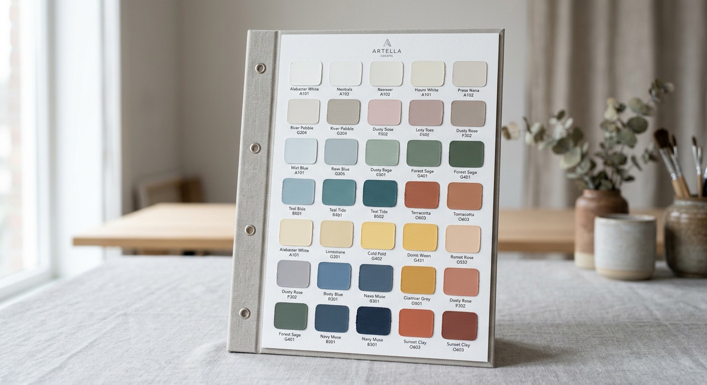
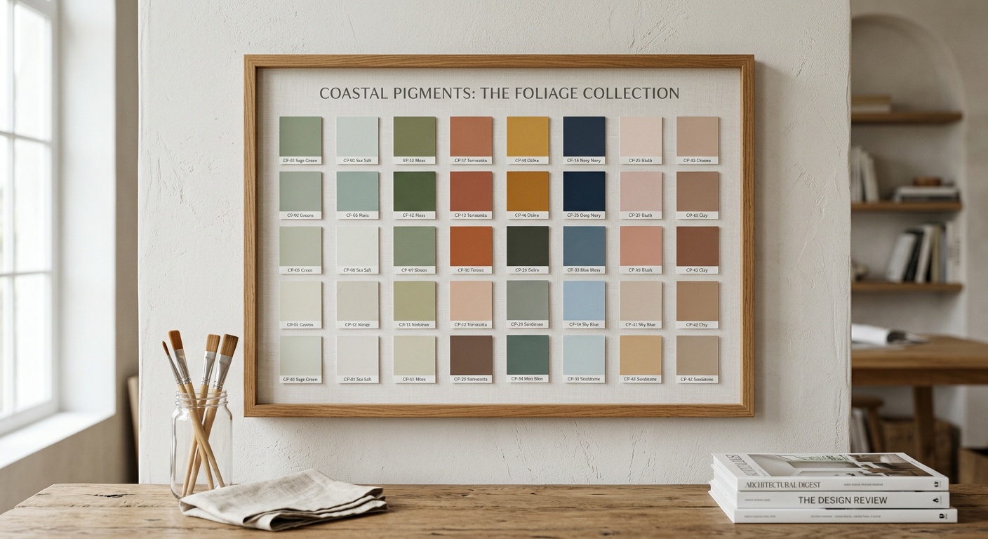
According to the latest color forecasts from major manufacturers, 2026 marks a decisive shift away from the stark, clinical whites and grays that dominated the 2015-2022 era. Warm neutrals, earthy greens, and confident deep tones are taking center stage. Behr’s 2026 Color of the Year, a muted terracotta called “Cavern Clay,” and Sherwin-Williams’ pick, a soft sage named “Renewed Sage,” both signal the same message: homeowners want warmth without sacrificing sophistication.
“People are craving color that feels grounded and lived-in, not sterile,” says color consultant Maria Killam, whose work has influenced residential design trends for over a decade. “We’re seeing a return to personality-driven palettes after years of playing it safe.”
Here’s the straight talk: trend colors matter less than *how* you apply them. A gorgeous shade in the wrong room, under the wrong lighting, can flop entirely.
Key Shifts Worth Noting
- Warm whites are replacing cool, blue-based whites in kitchens and bathrooms
- Moody blues and greens are moving from accent walls to full-room applications
- Tonal color drenching—painting walls, trim, and ceiling the same hue—is gaining serious traction
- Clay and terracotta tones are replacing millennial gray in living spaces
Room-by-Room Color Strategy
Quick scenario: Imagine you’re repainting your entire home this spring. Where do you even start? The answer is simple—start with the room you use most, then work outward using a cohesive but varied palette.
Living Rooms and Family Spaces
Living rooms benefit from colors that feel inviting during both daytime gatherings and evening wind-downs. Consider:
- Warm greige (like Sherwin-Williams “Accessible Beige”) for flexible, timeless backdrops
- Deep forest green for a cozy, library-inspired feel that pairs beautifully with warm wood tones
- Soft clay or terracotta for spaces that get plenty of natural light
Kitchens
Kitchens are the emotional heart of most homes, and in 2026, homeowners are moving beyond all-white kitchens. Sage green cabinetry paired with warm white walls, or deep navy island cabinets against cream perimeter cabinets, are two combinations designers report seeing repeatedly in 2026 renovation projects.
Bedrooms
Bedrooms should prioritize calm over trendiness. Muted blues, dusty lavenders, and soft sage greens consistently rank highest in sleep-quality studies for their calming psychological effects. Avoid high-energy colors like bright red or orange here—save those for spaces where you want alertness, not rest.
Bathrooms
Small bathrooms handle bold color surprisingly well because the enclosed space limits visual overwhelm. Deep charcoal, navy, or even black paired with brass fixtures has become a signature look in 2026 powder room design.
Home Offices
With hybrid work still the norm for roughly 35% of the workforce in 2026, home offices deserve real color intention. Muted blues and greens support focus, while a single accent wall in a richer tone can prevent the space from feeling flat during long video calls.
The Psychology Behind Paint Choices
Color psychology isn’t pseudoscience—it’s backed by measurable behavioral research. Studies from environmental psychology researchers consistently show that:
- Blue tones lower heart rate and are associated with calm, focused states
- Warm tones like terracotta and coral increase feelings of comfort and sociability
- High-saturation reds and oranges can increase appetite—useful in dining rooms, less useful in bedrooms
- Green is the color most associated with relaxation and balance across cross-cultural studies
Pro Tip: Test your chosen color at three different times of day before committing. Morning light, midday sun, and evening artificial lighting can make the exact same swatch look like three entirely different colors.
Common Mistakes and How to Avoid Them
Mistake 1: Ignoring Undertones
Every “neutral” has an undertone—pink, green, yellow, or blue—that becomes obvious once it’s on a large wall. The fix? Always test a sample patch at least 2×2 feet, and view it against your existing flooring and furniture, not just in isolation on the swatch card.
Mistake 2: Choosing Color Before Lighting Assessment
North-facing rooms receive cooler, bluer light and tend to make colors look more muted or grayed-down. South-facing rooms get warm, golden light that intensifies colors. A soft gray that looks perfect in a south-facing room might look flat and cold in a north-facing one.
Mistake 3: Overlooking Sheen Levels
Homeowners often obsess over hue and completely forget finish, but sheen affects both durability and perceived color intensity. High-gloss finishes reflect more light and can make colors appear brighter and more saturated than the same shade in matte.
Paint Finish Comparison: Which Sheen Fits Which Room?
| Finish Type | Durability | Best Rooms | Cleanability | Sheen Level |
|---|---|---|---|---|
| Flat/Matte | Low | Bedrooms, ceilings | Poor | None |
| Eggshell | Moderate | Living rooms, dining rooms | Fair | Low |
| Satin | Good | Kitchens, hallways | Good | Medium |
| Semi-Gloss | Very Good | Bathrooms, trim | Excellent | High |
| High-Gloss | Excellent | Doors, cabinets | Excellent | Very High |
2026 Homeowner Color Preference Breakdown
A recent survey of 2,400 U.S. homeowners planning renovations in 2026 revealed which color families they’re most likely to choose for main living spaces:
A Real-World Example: The Martinez Family Renovation
Consider the Martinez family’s 2025 renovation, completed just before this year’s design shift became mainstream. They painted their entire main floor in a single warm greige, then added confidence gradually: a deep sage powder room, a navy home office accent wall, and terracotta cabinetry in a butler’s pantry. The result wasn’t chaotic—it was cohesive, because every color shared the same warm undertone. That’s the real lesson: variety works when undertones agree.
Frequently Asked Questions
How do I choose a paint color without seeing it fade or change over time?
Choose quality paint with UV-resistant pigments, especially for south-facing rooms, and always request a fade-resistance rating from your paint retailer. Testing a sample on foam board (which you can move around the room) works better than painting directly on the wall since it lets you observe the color under multiple lighting conditions.
What’s the single best paint color for resale value in 2026?
Warm greige and soft sage green consistently top real estate agent recommendations because they photograph well, appeal to broad buyer demographics, and don’t feel dated the way stark cool gray has begun to feel post-2023. Avoid highly saturated or unusual colors in main living areas if resale is a priority.
Can I mix trend colors with my existing furniture without a full redo?
Absolutely. The trick is pulling one undertone from your existing furniture or flooring and matching your wall color to that same warmth or coolness. A single accent wall is also a low-risk way to test a trend color before committing an entire room.
Your Color Roadmap Forward
Choosing interior paint isn’t about chasing every trend—it’s about building a home that reflects both current design sensibilities and your own daily comfort. As color forecasting increasingly blends psychology, sustainability, and personalization, expect 2027 to push even further into customized, mood-responsive palettes.
Here’s your practical checklist before you pick up a brush:
- Test first: Sample at least three swatches per room under real lighting conditions
- Match undertones: Check your color against existing flooring, trim, and furniture
- Start with your most-used room: Build your palette outward from there
- Consider sheen, not just hue: Match finish to the room’s function and traffic
- Don’t fear commitment: Bold, well-chosen color rarely goes as wrong as homeowners fear
So, which room in your home is ready for a change? Start small, trust the process, and let your walls finally say something about who you are.